Yahoo! Weather Gets One Step Ahead by Working with Apple

It has been a month since I chose Yahoo! Weather app as my default weather app on my iPhone. I liked the UI style of the app, simple, information matter on the front and center and the pretty Flickr local scenery photos, all with good touch. After WWDC 2013, it turns out that this app fits right into the new iOS design. Is Yahoo!’s designers THAT good? Or they can see into the future?

The question became very obvious right after I delve myself into Apple’s ‘out-of-the-oven’ Mobile Human Interface Guideline (can be found here, need to have developer account to access):

Yahoo-Weather-before-afterr

Since iOS default weather app actually use Yahoo weather, I think designers in both companies must have talked before releasing their version of the weather app. Good for Yahoo! I’d say. And maybe in the future if we want to get a sneak peek into iOS changes, we could pay a bit more attention to Yahoo’s weather app?


What Exactly Apple Did with iOS 7?

icon-ios7

So the biggest announcement in tech industry is behind us. Yesterday in Apple’s WWDC 2013, the new iOS 7 was released to the public. My feeling towards it is a mixed bag. I liked the simplicity of the new design language, but not a big fan of the somewhat ‘childish’ app icon colors. I’m excited about the huge potential of iOS for cars (which deserve another blog), but not so keen on the Control Center. When all the excitement and disappointment quiet down, I tried to put all the pieces together and wonder what exactly Apple did on iOS 7?

Here is what I found out:

1. Stronger Design Rules

  •  Grid system:  As Jonny Ive put it ‘Developing a grid system allowed us to achieve a much more harmonious relationship between individual elements‘. A well designed and implemented grid system will hugely improve the inner relationship between scatter around UI elements, thus making them feel like part of a single piece. This is essential in ‘flat design’ that iOS is obviously influenced by.  Not that iOS 6 is designed without a grid system, it’s just that the previous ‘skeumorphism’ UI style give ample affordance and visual clue, thus a grid system’s importance is not as critical as a simplicity centered flat design.

ios7_grid_system


  • Redesigned color palette:  Anyone familiar the old iOS will find the new one way more colorful, to the extent of making some uncomfortable. These colors come from a re-designed palette that go well together. This actually reminds me of when iMac is first introduced to the market. The beautiful neon colors really capture a lot of attention. Some would say the new look of iOS is actually childish and will hurt its image of a professional device. I tend to disagree. There is nothing wrong about being colorful, being bold as long as it’s still well thought out and designed to please human eyes. iOS color has been dull for soooo long, and it’s time for a change.

ios-7-palette


  • Dynamic UI that get out-of-the-way when not needed:   Nothing can be said better than Apple’s own terms, and forgive my laziness of directly quoting them here: ‘The interface is purposely unobtrusive. Conspicuous ornamentation has been stripped away. Unnecessary bars and buttons have been removed. And in taking away design elements that don’t add value, suddenly there’s greater focus on what matters most: your content.‘ Also a ‘flat’ UI make doing this easier, since all the elements are mostly colorful geometric shapes, it won’t hurt the snappiness of the UI as badly as a ‘unwieldy’ heavy textured UI.

2. Industrial Design and UI Design Integration

This has been criticized all along. People complained about the minimalist industrial design of iPhone doesn’t match the ‘skeumorphism’ style UI. Now it seems with the iOS 7, they are start to come to the same direction: Simplicity. One good example is the layered effect iOS 7 trying to create with the use of translucency. It might look very subtle, but it means a lot. It makes your iPhone felt more legit and physical, more ‘real’. In heart, the new iOS 7 is still trying to be ‘real’, but it has evolved from ‘visual skeumorphism’ to ‘psychology skeumorphism’. After all, Apple is all about making technology human. Or put it in their own words:

“Technology should never get in the way of humanity”

ios7layer

3. More Mobile Friendly

  • Conserving Power: A big development iOS 7 bring to the table is to conserve power usage when the app is not in the foreground. No other company came close to how deep Apple dig to save the 1 minute of battery power.
  • Flat Design uses less CPU power, thus smoother: I bet the new iOS 7’s built-in UI image resource size is much smaller than iOS 6. To put it in layman’s terms: It has become leaner and faster. Exactly what mobile demands.

4. Character?

This is a vague feeling of mine. I can’t really put my finger to it. But the bold color, the subtle translucent layers, the smart UI that will hide themselves when I need to view my content, the smarter and more human-sounding Siri, etc. all give me a feeling that iOS 7 somehow come to life, has its own character, and evolved to be smarter and prettier. There’s a slice of humanity in it, no matter how thin it is. Maybe it’s just me day dreaming, or maybe this is also Apple’s vision?

BTW, the Apple official iOS 7 Design page is by itself a design lesson, I recommend going through it. It’s not just a sales pitch.


UICraft: Why Facebook’s New ‘Stickers’ is Stupid Yet ‘Sticky’

Following Path’s step, Facebook recently introduced a sticker feature in their messaging experience. Stickers are a glorified version of ’emojis’ which user can send to their friend while chatting to express emotions. It usually comes with a package of different expressions/emotions. All Facebook’s current stickers are free to download, but the ‘Free’ tag could very quickly become ‘$0.99’ like most Path stickers do.

Facebook-Messenger-stickers


Image via: phandroid.com

Stickers are no new creation by Facebook at all. A bunch of Asian messaging apps and services have already embraced it for some time. This whole ‘cuteness’ thing might seem silly, yet before you shout ‘stupid and cheesy!’, let’s not forget all the ‘stupid’ videos that got millions visits on YouTube. There is something behind all these ‘stupid yet popular’ fads. Most of them share one treats: They play very well to your emotion. And emotion, my friend, is usually our weakness. That is what’s behind all these impulse purchasing, all these ‘my brain tries to say no but my body screams YES’ moments, all those ‘this is so stupid but I just can’t stop laughing’ videos.

This is also why some  apps are successful in creating attractive experience. Enter ‘Clear‘, the highly successful to-do app with flat and simple visual but powerful physics and interactions. By swiping the item right, user can mark complete the task. Swiping left is delete the task, pinch open to add an item and pinch close to fold the current task list. It might sound simple, yet it’s physics is so great that when you are doing all these simple operations, you feel like you are manipulate a real object, you are throwing the completed task away like throwing your empty can of Coke to the dump. It relates to your feelings and emotions.

I still remember when the first time Apple released iPhone and introduced multi-touch, people are instantly amazed by the interactions without rationally knows why. Like Steve Jobs once put it in his keynote when demonstrating a multi-touch feature :” I can play this all day!’. As human-beings, we are sophisticated, we use our brains, we developed science. But most of the times, we aren’t that smarter when it comes to our emotion. We fall in love, get hurt, heal through it, and do it again. That just how emotion works. It is sticky and always comes back. No wonder after Path first announced their Stickers and In-app shop, they said the first week it brings in more money than all the money the company has ever earned before. No wonder Facebook is following suit.

Apple Adopting Flat Design? Yes, Please !


apple logo 2

There’s report that Apple’s legendary design master Jonathan Ive is leading Apple’s iOS user interface toward another direction: ‘flat design’.

This is really long time coming!  It’s about time we get some fresh air on iOS UI. And Apple shouldn’t let Microsoft steal all the thunder with Metro UI. I just can’t wait to see Apple’s interpretation of flat design!


Some thoughts on Google Keep

Google announced the new note-taking service Google Keep today. 

Image

I gave the web version a try. The UI looks very minimalism, using it is easy too. There aren’t many features to begin with though. It looks like just a lite, new service Google want to put on their cloud. Google didn’t mention whether they have bigger vision on the service, so we’ll just have to wait and see.

Some thoughts from a product design point of view:

1. Don’t have an ecosystem.  Take Evernote as an example, they have Chrome extension ‘Web Clipper’, Outlook plug-in, apps on all major mobile OS, PC/MAC software and a web-app. Making note taking available everywhere. Google Keep only have Android and web-app, kind of lacking still.

2. Multimedia support. Currently  it only supports text and photo.

3. Notes organization. I noticed that Keep lets you give a color to the note, and display the notes in ‘List’ view or ‘Grid’ view. Other than that, pretty much nothing. Maybe Google never really think about scaling? Or they want to position Google Keep as a lite note-taker instead of an information management tool?

3. Note sharing. Without sharing, Google Keep is likely to lose the biggest demographic of note taking: students. There are plenty of opportunities that Google could embedded Keep into their social media ecosystem. Share on G+ for one, follow friends/celebrities notes for another.

Obviously the service is still in its infancy. It will be interesting to see how it evolves. Hopefully it won’t be like Google Reader at least.

HTML 5 Development Cost Greater Than Native?

In the article from The Next Web: Accounting software startup Xero ditches HTML5 in favor of native iOS and Android apps

Our view is that HTML5 technologies can deliver as-good-as-native experiences…but the lesson from Fastbook is that it’s hard work – you don’t get those experiences out-of-the-box. And the lesson we’ve learnt over the last 12 months has been that the cost in time, effort and testing to bring an HTML5 application to a native level of performance seems to be far greater than if the application was built with native technologies from the get-go.

This surprises me a bit. One big reason for app developers to choose web app approach is because HTML5 is ‘cross-platform’, thus developers don’t have to deal with OS fragmentation and develop one version for each platform.

I guess this is due to immature of the ecosystem. By immature, it’s not just the technology itself, but also the developer talent pool as well as the tools and resources. We all know the ‘end-game’ for HTML5 is great, but to get there, there seems to be more hurdles than expected…

Eye-Tracking Smartphone UI: Yes and No

Came across this article ‘The Implications Of The Interface That Watches You” today. Eye-tracking as a new way of user interaction is intriguing, but after some thoughts, I think it’s very limiting:

eye-tracking

Image from: TechCrunch.com

1.  Eye movement is a’ subconscious’ behavior, hard to control.

When we move our hands, our brain needs to command it to do it and we’re aware of it. Eye movement is different. We do it unconsciously. We automatically blink when we read for a long time. We move our eye balls up and down when browsing the web without thinking about it. Now if an app or smartphone tracks our eye movements and makes the app responding to it, all these random moves will start to mess things up. User will grow nervous about their eye movements, adding HUGE pressure to the experience. A good app design should try as much as possible to NOT make user think. This is making user think MORE about something they never have to think about (eye movement) before. Totally wrong.

2. Dynamically changing UI screws location memory

The idea of changing the user interface based on people’s eye movement is even more absurd. Location memory is in the center part of user experience design. Human brains remember where things are and  it makes it easy for them to find it next time they want to use it. Dynamically changing where all the buttons and other UI elements are? User will become utterly confused as where things are.

3. Eye-tracking as data gathering tool is creepy but useful

So what is the better way of using eye-tracking technology? Simply put, using the data only. Quietly gathering eye movements data without messing around the UI, and then use the gathered data for better profile building, ads targeting etc. is actually a solid idea. Before, all the profile building technology stops at search and clicks. Google knows what website you clicks or searches, that’s how they build their targeting ads system that rakes in billions of ads dollars. But what if they can know which part of the screen get the most eye-balls? It’s definitely a step forward, both on precision and creepiness ironically.

Since camera has become so ubiquitous now, technologies like facial recognizing, eye tracking, gesture tracking will trickle down to our laptop and smartphones. Give or take, welcome to an era of new interactions.

Facebook News Feed Design Upgrade: Making Ads Count

Facebook recently released their new design of the ‘News Feed’. From the announcement, even though they didn’t mention a word about ads, I still smelt it. All of the design changes in a large part are to make Ads count. Here’s why:

1. Bigger photo = Bigger canvas for Ads

The new design comes with bigger photos and albums to offer a more engaging and immersive experience. While user contents become more immersive and prominent, so do embedded ads. (Facebook already embedded ads into user Timeline)

Bigger canvas means a LOT for advertisers in that it blurs the lines of a banner and a real ad page. Facebook should be able to charge a higher CPM rate if it proves to be more efficient.

2. Less clutter leads to more focus, on both user content and ads.

facebook-news-feed-update-march-7-2013jpg-d3f1ae554d07c445

Facebook’s current news feed feels cluttered. It easily triggers the ‘cognitive overload‘ issue and a lot of the users just back away from it, or totally ignore the blob of ads on the right side of the page. With the design changes, there are less contents in one page, but they will get more attention and focus. Coupled with more compelling photos, even boring ads that no one wanted to station their eyeballs before will get some love with the new design now. Less really is more.

3. Better content curating can also mean better ads targeting.

Another big part of the design is better curating. Facebook promised to offer the best ‘personalized newspaper’. Every ‘Like’ or ‘Share’ you make on Facebook will all being monitored and analysed to further ‘fine tune’ content to your taste. Your timeline will then become more relevant and personalized. This all sounds fantastic on the surface, but wait! Ads will become more relevant and personalized too! This is not necessarily a bad thing though. With better targeted ads (and hopefully higher CPM rate), Facebook could actually afford to not bombarding ads to their user, and offer less intrusive experience. 

Summary

Overall, I think designers in Facebook deserve some applause. They make the layout more streamlined, promoting ads without downgrading experience, and finally being consistent with their mobile experience. Like I pointed out in my another blog, done right, it could be a win-win to everybody. 

New Path 3.0, New Path to Monetization

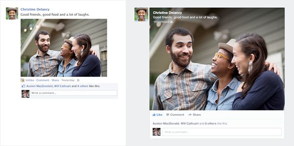
Path today announced Path 3.0, featuring a much-anticipated private message functionality and a pretty little in-app ‘Shop’.

path shop

Also, Path’s CEO Dave Morin in an interview with The Next Web, revealed that a premium subscription service is coming. Path is really speeding up on further monetizing their 6 million subscriber base.

To keep it short, here’s a list of current and possible monetization venues for Path:

1. Stickers (Current)

path stickers

Crafted by celebrity designers, Path Shop now offers a variety of emoticon-like images called ‘Stickers’ that users can post on their private message with friends to express emotions. This isn’t a brand new idea, but it’s executed quite well. From the introduction of designers to add credibility, to the fine skeuomorphism style Shop UI design, the shopping experience is well polished and streamlined.

2. Filters for Photo and Videos(Current)

Photo Mar 07, 10 24 17 AM

Photo and Video filters have been Path’s major ‘in-app purchase’ for some time now. Integrating it into the Path 3.0’s new ‘Shop’ experience is natural and seamless. One thing worth noticing is the UI design for the filter. It’s clean and effortlessly shows the ‘before and after’ comparison using a realistic lens filter shape (with filtered part of the image inside) on top of a non-filtered photo, instantly demonstrating the difference it makes.

3. Theme (Potential)

Path’s UI has always been praised and well accepted as the yardstick of mobile app design. There are many users (me included) love to play with new apps just because we love the designs and polished themes. Being able to customize the app I love to the color and style I prefer has great value. What if Path unleashes their design power and develop 10 different themes that user can choose freely (after purchase of course)? This could involve some app infrastructure upgrade to support themes personalization but hey, when the money starts to roll in, it will be worth it, right?

Essentially, by doing this, Path can turn UI from infrastructure to digital goods, at the same time offering better user experience by enabling customization.

This is not a new idea either. Some Asian apps are already doing this, and Path seems to get some of their inspirations from Asian anyway.

Photo Mar 07, 10 00 14 AM

4. Premium Membership (Potential)

Path is already planning it, and supposed to launch it first half of this year. We don’t know about details of what’s in the premium package. But if I’m allowed to guess, it would be dedicated member filters, stickers and maybe even some cloud space for photos and videos. This would be interesting to watch.

5. Avatars (Potential)

Currently, Path lets you choose your photo and slap it in a simple circle as your avatar. The thing is, not all the people feels comfortable or wants to use their photos as avatars, some prefer their hobbies (golf ball anyone?), some may like a super hero character from his favorite comic. Being able to offer more avatar choices will definitely add value (and revenue also). Also this goes with Path’s private social network positioning well, imagine a cubic engineer chooses an Amazon warrior as his avatar, well I’d say it’s very private…

Amazon-GameArt

Summary

Path has always been my favorite social network app. Its polished design, smooth interaction and minimalism design all set them apart from the pack. It’s great to see them making steady progress on bring in more revenues also. What other ways can they monetize? Leave a comment and let me know!

Kinect On Laptop?

The Verge today has a video showcasing Microsoft’s new progress in bringing Kinect to laptop/desktop as a new interaction model. 

This is … interesting, makes me feels like I’m playing my Xbox Kinect games. I can totally imagine using gestures to turn up volume or switch channel on my TV, but wait, aren’t we also going to use this on work and stuff? Which is not as fun as playing games on Kinect. Moving my arms around like this for hours just blows my mind, especially if I’ll have to stop my arm mid-air to do the needed accuracy adjustments… felt tired already. I think this will have the same ‘gorilla arm’ challenge as laptop with a touch screen

But wait, maybe there is a way out. Introducing … the ‘Hand Signs’ system!

hand signs


What do you think?