Recently Twitter released its new standalone short video sharing app ‘Vine’. It’s début isn’t without some controversies, but overall it’s a solid app with great potentials. All the dramas aside, I want to go ahead and do a bit of UI analysis on this hot social app, and see if we can find something interesting:
1. Biggest Screen Ever
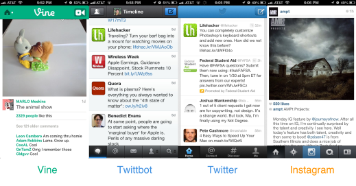
Unlike the quite prevalent ‘5 Tabs Nav Bar’ design pattern other social apps have adopted, Vine doesn’t have a global navigation bar at all. It gives user the most screen real estate to display content, while UI gets out-of-the-way. Launch the app and you’ll see a video playing right away in loops, instantly immersive. Keep scrolling down and you’ll get end-less (literally) content, and there’s no bottom bar with 5 different icons to increase your cognitive load. The interface is clean and minimum.
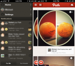
Notice that in above pictures, Twittbot, Twitter, Instagram all have the bottom navigation bar. It’s useful if user wander between these app sections a lot. But for a lot of users, most of the time they stay at their timeline viewing, thus the nav bar only gets in the way unnecessarily. Vine isn’t the first app to come up with this kind of ‘flat’ approach to content presentation. Path, which is another ‘intimate social network’ service, also shares the same ‘put content front and center’ philosophy.
Path don’t have global navigation bar either, and they uses a side menu that’s hidden from the content panel, only revealed when the content panel slides to the right. Without the navigation bar, Path is able to keep the interface clean and display more content also.
2. Better Icon-Label Connection
Again using the picture above as an example, it’s really hard if not impossible to figure out what those little navigation bar icons stands for. Twitter at least put the label beneath the icons (but it’s very small, hard to read), Twittbot and Instagram only use icons, thus users will hesitate and ask themselves what those tabs are for before touching them. As we all know it, making users stop and think = bad user experience.
Vine uses a drop-down menu to switch between app sections. In the menu, pretty and sizable icons are displayed along with the section name. When user gets into the respective section, the icon will stay on the top left corner, and the title will be in the middle of the title bar, further strengthen the connection.
3. Making ‘Like and Comment’ Easier
People are comparing ‘Vine’ with ‘Instagram’ by claiming ‘Vine is the Video Instagram’. They do have some resemblances in UI design. One case in point, they all use a ‘Like’ and ‘Comment’ button for the viewer to leave feedback. The difference is size, where Vine’s buttons are bigger than Instagram, which makes them more ‘touchable’, encouraging people to express their opinion, further foster the social part of the app.
5. Some flaws?
During the review, I also found some design hard to understand. For example, it is a video sharing app, but the only way you can capture a video is to go to ‘Home’ and touch the top right corner icon (no labels either). For such a prominent function as creating video, this is a bit too modest. Maybe Vine’s design team think this app as more of a major content consuming app than a content creating app I don’t know, but if making a video is not as easy as taking a photo, this will hurt its subscribers growth. Video is harder to capture and thus needs more love from UI/UX.
To Sum it up
Overall, I felt the application’s UI and UX is carefully designed. It’s not as sophisticated as Twitter, or as fancy as Path, but it gets the job done very efficiently. The UI gets out-of-the-way as much as possible, people will not have a hard time finding their way around because it’s just not that many layers worthy of the term ‘Information Hierarchy’. Everything is quite buttoned up. It’s simple and even ‘shallow’. (Interestingly, some say the early contents are also ‘shallow’, but addictive.) But simple can be powerful, and easier to get viral, which is critical critical for a new social service.


