Yahoo! Weather Gets One Step Ahead by Working with Apple

It has been a month since I chose Yahoo! Weather app as my default weather app on my iPhone. I liked the UI style of the app, simple, information matter on the front and center and the pretty Flickr local scenery photos, all with good touch. After WWDC 2013, it turns out that this app fits right into the new iOS design. Is Yahoo!’s designers THAT good? Or they can see into the future?

The question became very obvious right after I delve myself into Apple’s ‘out-of-the-oven’ Mobile Human Interface Guideline (can be found here, need to have developer account to access):

Yahoo-Weather-before-afterr

Since iOS default weather app actually use Yahoo weather, I think designers in both companies must have talked before releasing their version of the weather app. Good for Yahoo! I’d say. And maybe in the future if we want to get a sneak peek into iOS changes, we could pay a bit more attention to Yahoo’s weather app?


What Exactly Apple Did with iOS 7?

icon-ios7

So the biggest announcement in tech industry is behind us. Yesterday in Apple’s WWDC 2013, the new iOS 7 was released to the public. My feeling towards it is a mixed bag. I liked the simplicity of the new design language, but not a big fan of the somewhat ‘childish’ app icon colors. I’m excited about the huge potential of iOS for cars (which deserve another blog), but not so keen on the Control Center. When all the excitement and disappointment quiet down, I tried to put all the pieces together and wonder what exactly Apple did on iOS 7?

Here is what I found out:

1. Stronger Design Rules

  •  Grid system:  As Jonny Ive put it ‘Developing a grid system allowed us to achieve a much more harmonious relationship between individual elements‘. A well designed and implemented grid system will hugely improve the inner relationship between scatter around UI elements, thus making them feel like part of a single piece. This is essential in ‘flat design’ that iOS is obviously influenced by.  Not that iOS 6 is designed without a grid system, it’s just that the previous ‘skeumorphism’ UI style give ample affordance and visual clue, thus a grid system’s importance is not as critical as a simplicity centered flat design.

ios7_grid_system


  • Redesigned color palette:  Anyone familiar the old iOS will find the new one way more colorful, to the extent of making some uncomfortable. These colors come from a re-designed palette that go well together. This actually reminds me of when iMac is first introduced to the market. The beautiful neon colors really capture a lot of attention. Some would say the new look of iOS is actually childish and will hurt its image of a professional device. I tend to disagree. There is nothing wrong about being colorful, being bold as long as it’s still well thought out and designed to please human eyes. iOS color has been dull for soooo long, and it’s time for a change.

ios-7-palette


  • Dynamic UI that get out-of-the-way when not needed:   Nothing can be said better than Apple’s own terms, and forgive my laziness of directly quoting them here: ‘The interface is purposely unobtrusive. Conspicuous ornamentation has been stripped away. Unnecessary bars and buttons have been removed. And in taking away design elements that don’t add value, suddenly there’s greater focus on what matters most: your content.‘ Also a ‘flat’ UI make doing this easier, since all the elements are mostly colorful geometric shapes, it won’t hurt the snappiness of the UI as badly as a ‘unwieldy’ heavy textured UI.

2. Industrial Design and UI Design Integration

This has been criticized all along. People complained about the minimalist industrial design of iPhone doesn’t match the ‘skeumorphism’ style UI. Now it seems with the iOS 7, they are start to come to the same direction: Simplicity. One good example is the layered effect iOS 7 trying to create with the use of translucency. It might look very subtle, but it means a lot. It makes your iPhone felt more legit and physical, more ‘real’. In heart, the new iOS 7 is still trying to be ‘real’, but it has evolved from ‘visual skeumorphism’ to ‘psychology skeumorphism’. After all, Apple is all about making technology human. Or put it in their own words:

“Technology should never get in the way of humanity”

ios7layer

3. More Mobile Friendly

  • Conserving Power: A big development iOS 7 bring to the table is to conserve power usage when the app is not in the foreground. No other company came close to how deep Apple dig to save the 1 minute of battery power.
  • Flat Design uses less CPU power, thus smoother: I bet the new iOS 7’s built-in UI image resource size is much smaller than iOS 6. To put it in layman’s terms: It has become leaner and faster. Exactly what mobile demands.

4. Character?

This is a vague feeling of mine. I can’t really put my finger to it. But the bold color, the subtle translucent layers, the smart UI that will hide themselves when I need to view my content, the smarter and more human-sounding Siri, etc. all give me a feeling that iOS 7 somehow come to life, has its own character, and evolved to be smarter and prettier. There’s a slice of humanity in it, no matter how thin it is. Maybe it’s just me day dreaming, or maybe this is also Apple’s vision?

BTW, the Apple official iOS 7 Design page is by itself a design lesson, I recommend going through it. It’s not just a sales pitch.


Thoughts On Recent Attack on Apple from China State-Run Newspaper

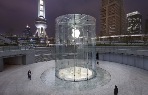
apple-china-store-pudong

Recently, Apple got attacked by Chinese government owned media a lot. Here’s my perspectives:

Firstly, Chinese consumers pretty much know the governmental media’s true color and that their claim against Apple is all lying or twisted. The recent scandal ’820 Event’ speaks it all. (more details here: http://tech.fortune.cnn.com/2013/03/16/apple-weibo-china-cctv/)

Secondly, government itself also knows what they are saying is bullshit. A lot of government officers, their children, family members use iPhone and they won’t use it if the service is bad. They just has an agenda and a marching order.

Lastly, over time, Chinese netizens have already developed a habit of interpreting whatever government media claims reversely. If the media claim someone is bad, then that someone must be actually good! So all the ‘attacks’ in effect are good PR for Apple.
Read more at http://macdailynews.com/2013/03/26/china-slams-apples-empty-and-self-praising-response-to-warranty-complaints/#gWutMWgbWaC3ohvh.99

Apple Adopting Flat Design? Yes, Please !


apple logo 2

There’s report that Apple’s legendary design master Jonathan Ive is leading Apple’s iOS user interface toward another direction: ‘flat design’.

This is really long time coming!  It’s about time we get some fresh air on iOS UI. And Apple shouldn’t let Microsoft steal all the thunder with Metro UI. I just can’t wait to see Apple’s interpretation of flat design!


HTML 5 Development Cost Greater Than Native?

In the article from The Next Web: Accounting software startup Xero ditches HTML5 in favor of native iOS and Android apps

Our view is that HTML5 technologies can deliver as-good-as-native experiences…but the lesson from Fastbook is that it’s hard work – you don’t get those experiences out-of-the-box. And the lesson we’ve learnt over the last 12 months has been that the cost in time, effort and testing to bring an HTML5 application to a native level of performance seems to be far greater than if the application was built with native technologies from the get-go.

This surprises me a bit. One big reason for app developers to choose web app approach is because HTML5 is ‘cross-platform’, thus developers don’t have to deal with OS fragmentation and develop one version for each platform.

I guess this is due to immature of the ecosystem. By immature, it’s not just the technology itself, but also the developer talent pool as well as the tools and resources. We all know the ‘end-game’ for HTML5 is great, but to get there, there seems to be more hurdles than expected…

UICraft: Zite’s New Rating UI

Zite is a pretty awesome self-learning, self-evolving intelligent specie(app) in the app universe. He feeds you with content gathered from Internet and devour your rating (Like/Dislike) so he can evolve into a clone of your news taste.  The more rating you give him, the faster and stronger he’ll evolve, and you’ll be fed with better quality universe essence (selected content).

Well, enough of my ‘crappy’ Syfy analogy. Zite has always been my favorite news aggregator. The minimalism design and the personalized rating system make it perfect for my daily news consumption. The app got an upgrade lately and I found the rating UI also evolved a bit, and I love the changes.

Before:

Zite displays a ‘rating bar’ on the bottom of the screen, where user can ‘like’ or ‘dislike’ the content. The ‘liked’ content will be fed to the user more often, while the ‘disliked’ less. It’s a simple and effective user interface:

Photo Mar 14, 3 25 56 PM

User can touch the ‘thumbs up’ button to ‘like’ and ‘thumbs down’ button to ‘dislike’.

After:

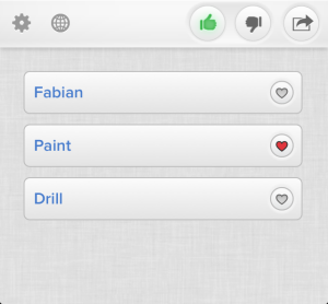
The new UI looks the same, but adds another rating layer when you touch the ‘thumbs up’ button:

ZITE rating bar evolved

If you like the content on the page by touching the ‘thumbs up’ button, the rating bar will expand upwards and display multiple tags related to the page. You can further specify which tag represent the reason for your ‘like’, so Zite could know more precisely what part of the content you like and feed you more in the future.


Summary

Content rating system has become more and more important for all the content providers. Great content is no longer great enough for today’s indulged users.  As a content provider, you need to offer great personalized content. And to do that, you need to have a powerful and easy to use content rating system to learn your user’s taste. The system needs to powerful enough so it can efficiently pinpoint user’s like and dislikes, but not making the experience too complicated so user will get overwhelmed. That’s why ZITE’s new UI did such a great job. Simple and intuitive 2-steps UI that nailed the sweet point of the content for the user.

Maybe Netflix, YouTube and other content providers could all take one page or two from ZITE’s UI playbook.

UICraft: What Apple Map UI Done Right

A lot of people hate Apple Map. Bad directions, corrupted map data, police warnings, you name it. Yet most of the criticizes are pointing toward the back-end map data, not to the map user interface and user experience. Actually, no one seems to have talked about it. After a closer look, I found that Apple Map UI did one thing or two right:

1. Less clutter

The overall Apple Map layout is designed to avoid ‘cognitive overload’ as much as possible. Road names only get displayed when it helps the navigation, instead of throw all the names across the map.

Apple Map:

Photo-Mar-12-9-16-45-AM.png

‘I-75’ is displayed because that’s the road on which the car was currently driving. ‘Akers Rd’ is displayed because it offers a reference point of where the car is at the moment.

There is no clutter here. The user can know where they are at a glance (Driving on I-75 near ‘Akers Rd’’.) . Minimum ‘eye-off-the-road’ time. Good for safety.

Waze and Google Maps:

Google_maps_nav1.png

Google Map

waze-map-navigation.jpg
Waze Navigation App

Road names are everywhere and random.  The user needs good eyesight and extra time to figure out which road he is driving on and where exactly he is on that road. More ‘eye-off-the-road’ time. Bad for safety.

2. Clear information hierarchy with relevant information

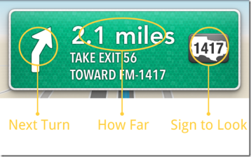
The single most important part of a map navigation UI is the ‘Navigation Panel’ where all the navigation information is displayed. The most critical navigation questions we ask ourselves are:

  • ‘What should I do on the next Turn?’ (Left, right, exit highway, etc.)
  • ‘How far till I have to turn?’ (A number in miles or feet.)
  • ‘Which sign should I look at?’ (The road or exit sign.)

Apple Map:

navigating-panel-1

As we can see from above screenshot, the information is very clearly spelled out. User is able to get direction within 2-3 seconds.

Google Map:

nav panel google

All the information is on there, but they are all with same visual weight. User will have to read through the entire sentence to get what they need. They can’t skim, thus more time-consuming (5+ seconds).

3. Subtle color coding is intuitive

Apple Map:

Photo Mar 12, 9 19 17 AM

Light Blue:  Current route, Car Indicator (round badge), Next Turning Point

Green: Other reference road names.

Very easy to filter useful information. Blue = useful. Green: reference only.

Google and Waze Map:

waze map navigationGoogle_maps_nav1

No color coding on road or road names at all.

4. Lock-Screen peace of mind

Another thoughtful thing about Apple Map design is how navigation works with handset’s lock screen. When using the smartphone as GPS, battery life is always a concern. (You can’t expect people to always has a car charger around). When driving straight on a highway with the next turn is 100 miles away, there is no reason to keep the smartphone screen on all the time. But locking the screen risks missing the important exit (yes there’s always voice prompt, but we are driving at 70mph after all).

Photo Mar 12, 9 18 50 AM

How Apple Map solves this problem is quite smart. When navigation is on, if you lock your iPhone, the navigation screen will get on the lock screen. So if you want to check how far you’re to the next exit, just push Home or Power key to turn the screen on, don’t even need to unlock the screen. Better yet, when you’re approaching the next turn, the lock screen will automatically lit up until you successfully make the next turn.

Summary:

Adding all these together, I found Apple Map still holds its high standard when it comes to user interface and user experience design. The map data may be screwed up, but the design is still killer.

UICraft: Rethinking Touch Screen on Laptop

Recently Microsoft and Google all release their own laptop with a touch screen. People start to speculate that this is the next big thing in tech industry. As a big fan of product design, user interface and touch technology, this is a very intriguing topic for me, so I went ahead and did some research. Here is what I found. Again, quick takeaways if you don’t have time for a deep dive now.

Rethinking-Touch-Screen-on-Laptop

Tablets and smartphones have become very popular lately. It’s so popular that touch as a new interaction paradigm has forever changed how people interact with their devices. Technology has never been so intimate and intuitive to normal users. There is something for you no matter you’re 8 years old or 80 years old. People start to think, if touch is so great, why not bring it back to our PC/laptop? We want to touch everything on the screen! Yet, before we get too excited about the idea, there are some challenges we need to be aware of and address carefully.

1. Laptop UI needs to be touch-optimized for the entire ecosystem

Touch works so well on tablet and smartphone because the OS is designed from the ground up to be touch-based or touch-optimized. The buttons are  bigger so even the fattest finger won’t have any problem touching it. The information architecture is flatter so everything is more discoverable. New interactions like pull to refresh, pinch to zoom are invented to enhance the experience.

iPad_multitouch

Image Source: Apple.com

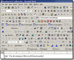
But what we take for granted on a touch-based OS is not there yet on our laptop. The laptop OS is not designed with touch in mind. They were designed in the early days when mouse and keyboard is still the ‘new paradigm’. All UI elements are quite small since mouse cursor has very high accuracy. As people’s major machine for work, the softwares’ UI are designed to have 10 toolbars with 100 buttons on it, just to increase efficiency. Like this:

microsoft-word-toolbars-crazy

Image Source: http://blog.vlad1.com

To make a traditional laptop OS ‘touch-optimized’ is a more complicated job (making UI elements touchable, supporting sophisticated touch gestures, just to name a few) than just draw an equation between ‘touch’ and ‘click’.  It also involves the entire ecosystem, not only the OS itself. Software developers all need to implement the design upgrade. And if this challenge cannot be tackled, the touch experience on a laptop will remain ‘underwhelmed’ to users come from tablet space and ‘confused’ to the those only familiar with desktop computers.

2. Frequent inputs demand minimum interaction cost

Let’s face it. Your laptop is more and more becoming a content creating only machine. It’s really not optimized for content consuming these days. And we all know that content creating involves a lot of user input, be it entering a paragraph of text, making edits in spreadsheets or draw a vector in Photoshop. The users need to interact with their laptop to get the job down. And all interactions, my friends, come with a cost.

For touch, the biggest cost is that you’ll have to move your arms around. Since the tablet or smartphone are used mainly as a content consuming device which don’t demand a lot of user interactions, it’s still OK. But laptop is a content creating device. Frequently moving your arms around, and you have the ‘gorilla arm’ problem. Working for 8 hours and you’ll definitely felt arm sour or even ache. It’s not like moving inches using your mouse after all.

Vertical-Multitouch-300x164

Image Source: Wired.com

3. Arm travels need to be minimized

Touch involves arm travel. The bigger the screen, the further arm will have to travel to get the job done. We can grade the extent of involvement by how many joints one has to use to perform certain level of touch interaction.

Single Joint (Smartphone): Finger joints. Very comfortable, one hand operation.

Double Joints (Tablet): Finger and wrist joints. Still comfortable, but user has to hold tablet now

Triple Joints (Laptop): Finger, wrist and elbow joints. Not comfortable, gorilla arms.

Entire Arm (Desktop): Finger, wrist, elbow and shoulder joints. Very uncomfortable, only viable for special case.

The more joints it involves, the harder it is to perform a touch interaction, and the worse the user experience. Laptop screen size ranges from 11 inches to 19 inches. User will have to use up to their elbow joint to move around the screen, and if they are doing interaction intensive work for 8 hours? Well let’s just say they are no ‘Iron Man’.

iron man

4. Greasy screen issue

Greasy screen issue is not a laptop only issue. Tablet and smartphone also suffers from it. But user’s expectation is different here. For smartphone and tablet, people are putting fingers on it from day one, so it’s not a new issue for them. Also since the screen is smaller, the grease or finger prints aren’t too obvious, while for the bigger screen on laptop, they are easier to spot. Yes, users can use some laptop detergent kit to clean the screen, but it came nowhere near the convenience of rubbing the screen clean on user’s jeans, right?

5.  Need scale to lower touch screen cost

Cost difference is another important factor.  Even if touch is a compelling feature on laptop, if the cost increase is too much, people may not want to pay for it. Currently a touch screen based laptop cost 120$ to 150$ more than its non-touch counterpart. This will become less of an issue when the economy of scale kicks in, but it’s extra investment that OEM needs to put in to make things happen.


What are the ‘big boys’ doing?

apple-logo

                            Apple – The Seamless ‘Migrator’.

Apple’s approach on this is a bit on the ‘conservative’ side. Simply put, their strategy can be described as ‘Incremental Migrate ’. They are the first to introduce multi-touch interface and iOS is still the best mobile OS in terms of user experience. If we look at the recent evolution of their laptop Mac OS X, a lot of the UI changes (Mission Control, Full Page Swipe, Pinch/Double Tap to Zoom, etc.) are the mobile UI paradigms trickling down to laptop OS. Apple is addressing the OS ecosystem UI challenge incrementally, by introducing touch features into laptop one at a time.

On the arm travel distance challenge front, they have introduced a lot of multi-touch features leveraging their upgraded Magic Trackpad. User still only need to move their finger joints, yet enjoy most of the benefits multi-touch has to offer. They are slowly educate their laptop users, preparing them for the ultimate jump (full touch) that’s to come.


new-microsoft-logo-600Microsoft – The Heavy ‘Committer’

Contrary to everyone’s expectation, this time Microsoft is leading the industry and taking a big leap forward bringing touch to laptop. Their new flagship OS Windows 8, leverage its unique and sophisticated Modern UI, is a fully touch-enabled OS. User that don’t want to use touch can still switch back to Windows traditional UI. It sounds quite rosy, but people actually used the Surface Tablet running Windows 8 reported that it’s confusing and hard to use.

It seems that most Windows users are not ready for full-fledged touch OS yet. They are still learning to walk, and Microsoft already starts to run.


Google logo transparentGoogle – The Light Water-Tester

Google is not known as a hardware manufacturer. Yet lately, they are more and more involved in  hardware products. Case in point? Their Nexus line and Chromebook initiative. Recently, Google released their new Chromebook Pixel product, featuring a very nice touch-enabled Retina display. From the product reviews, Google hasn’t do any touch-optimization on the Chrome OS yet. It seems to me they are using touch as only an ‘enhancement’ to the browsing experience. They are just testing the water here. 


Summary

How the innovation landscape will shape up around laptop touch screen is yet to be revealed, and you’ll never know what will happen next. But the idea itself, barring all the challenges it faces, is still interesting and has great potential. Which direction do you think it will go? Among Apple, Microsoft and Google, who do you think has the best chance of success? Leave a comment and let me know!

Gadget Leasing Business Starts to Make More Sense

Leasing-over-owning

Most of the time, I felt good owning something. But the idea of leasing a consumer electronic device starts to make more and more sense lately.

1. Forever The Hottest Gadget

It’s like buying a car vs leasing a car. With buying, you have a cost advantage and feel of ownership, while leasing might be a bit more expensive, but you always drive a new car!

See my point here is, consumer electronic devices like tablet, digital camera or even smartphone all have such a short life cycle these days, and we always want to use the newest iPhone or Galaxy devices, right? Always buying new ones are a waste of money (how are you gonna deal with your last year’s devices, throw them all away?), but having to settle on last year’s technology might mean hell for a lot of gadget lovers (read, me myself). So gadget leasing seems a good alternative, if the price is right.

The price of tablet rental ranges from $15 to $35/day, depending on service level and device. I can’t find a long-term leasing solution but I would assume it should work like leasing cars, you get a price premium in exchange of peace of mind and new gadgets.

2. Freedom of Choice 

Tired of iPad and want to try the new Galaxy tablet? Want a smaller iPad Mini instead of the bigger iPad 2? Prefer an E-Ink Kindle for better reading experience? Want to try out the new Chromebook Pixel to get a taste of future technology? With leasing model you can do them all without ditching out too much money. Everyone love to have choices. Having the opportunity to always try out the newest gadgets is an extremely appealing idea.

3. Pre-Loaded Content

My wife always complains about my addiction to Apple Store. Every time we go out shopping in a mall, I’ll try to visit the Apple Store. ‘You’ve seem them all so many times and own most of the devices, why would you still want to go there? Don’t you feel boring after some time?’ Not really, because in there, I gotta try the newest pre-load apps on their iPads and iPod Touchs. There are always something new and I don’t have to pay for it.

This applies to leasing also. Leasing service providers can load the most popular games and TV shows and musics on the gadgets, and users not only can enjoy the most up-to-date hardware, they gotta use the software also.  Starbucks already starts to provide free content to customers to add more value, same thing can be done to tablet leasing, only easier.


What do you think of gadget leasing? Will it be the next big thing?


Fujitsu’s Senior Smartphone Debut : A Falling Leaf, A Coming Fall

stylistic_s01_front_frFujitsu recently launched its first Android based smartphone with France Telecom. I know there’s nothing ‘exciting’ to blog about, but there’re some serious implications from it, just like people can tell the fall is coming from the falling of a leaf. 

1. Accessibility to a whole new level.

Every UI/UX designer should take accessibility into consideration these days, but in most cases people do it just to conform to regulation requirements. It has never be in the center of the design stage before. But by choosing to release its first smartphone as a senior oriented phone with unique features and user interface, Fujitsu made a serous commitment to accessibility, from regulation abiding level to business sell point level. There are cold numeric business calculation behind it yes, but it’s still heart warming to see seniors are targeted and well thought out designs are making their use of smartphone much easier. Seniors want a piece in the mobile trend also!

2. Android OEMs start to tap into niche market already

This is something where iOS ecosystem is lagging behind actually. Don’t get me wrong. iPhone is still very popular and I’d even say it’s still main stream and leading the innovation. But on niche markets, they are not making much progress. Reason? Simple. Because Apple is but ONE company and they release but ONE phone per year. This is a pretty hard limitation. Yet for Android, there is always your ambitious ‘new comers’ want to do something different to strike from different angle, thus the senior demographic targeting Fujitsu. If you ask an elderly which phone he will use, a dedicated designed senior phone or iPhone with some accessibility enhancements. I don’t think the answer will be too hard to guess.

3. Flexible UI Themes for iOS to close the gap

Yet hope is not all lost for iOS ecosystem. When Steve Jobs first release the iPhone, one notion he brought up in his keynote about why traditional handset OEMs did wrong is hard keyboard. He claimed that what hardware can do on one thing, software can do equally well on the same thing with one hundreds different ways. And that leads to the rise of mutli-touch technology and touch screen becoming the ‘de facto’ choice for phones just because it’s so flexible.

Along the same line, the user interface potential for iOS to evolve and become more flexible to address more niche markets are huge. For example, by introducing different user interface design tweaks as different ‘themes’, your iPhone can actually look and feel like a senior phone, or enterprise phone, or kid phone. At the center, it’s still iOS, but on the user experience level, it can be optimized for different purposes.  This has been the strength point for Android from the very beginning, ability to tweak the interface, and iOS do need to play catch up.

A good start of this would be introducing ‘Dashboard’ of Mac OS into iOS. Put all the relevant information and widgets on top, so the ‘update hungry’ users can quench their thirsty in one glance. I’ll try to write a separate blog on this in the future. 

All in all, a move to make dedicated device for older guys is always welcomed, and I had a feeling that we’ll see more of these kinds of dedicated devices in the future.